I spent a huge amount of time considering how to do this right - it's the bit I'm going to be looking at most when I drive the car, so I want it to look good and do the job it's meant to do, and ideally look like something that TVR could have made themselves. It took many iterations to arrive at a design I was happy with; the main issue being the small analogue dials at the bottom of the decal. The two motor hubs are offset from the centre, so if I were to draw an actual semi circle gauge around them, I would end up with an extended circle which looked very odd indeed. The solution was to angle each dash mark toward the real centrepoint of the circle rather than the motor hub, and to stretch the circle into an ellipse. The exact dimensions of the ellipse took forever to get right, so the dial "looks" like a circle as you feel it should be, but the needle doesn't look wrong travelling on a circular track and thus changing its distance to each mark on the dial. After much fiddling I arrived at the following design which I then 3d printed as seen in the previous post:


I then began to speak to some suppliers. The way these are built is that a piece of translucent material is screen printed with a series of colour layers; the decal main colour, behind that the coloured layers which are intended to be rear lit with white light to produce a backlit effect, and then a series of opaque blackout layers to prevent light travelling through where you don't want it. Screen printing to this accuracy on a multi layer print is quite challenging and requires specialist equipment, so I approached some specialist dial manufacturers, but I was surprise to find that almost none of them could screen print to the resolution I was looking for to get the fine marks on the small dials. To make these I would need a resolution of 0.1mm, which I was advised to increase by fattening up the marks on the dial. I modelled this up and was not satisfied - it looked wrong and inelegant so I pushed on with another supplier who also did fine dials and clock faces; Bedford Dials in Telford. These guys are first class and after sending me a sample, I agreed to work with them. To begin with I was asked to produce a 100% scale drawing for them to look at, along with a .dxf drawing file.

I had assumed 2mm thickness for the decal, and thus a chamfered edge on the aperture where the OLED display would sit to make it look right. The first issue was that the translucent plastic they used did not run to 2mm thickness, and in any case, backlighting the dial would likely bleed light through the chamfer around the OLED unless it was hand painted afterwards. This didn't sound like a good idea, so I agreed to reduce the thickness to around 1.2mm though was worried this would make the decal bendable which may allow it to move under the vibration of the car in the unsupported centre of the dial. I was pleasantly surprised that actually this is still very rigid and works perfectly; so far so good.

Bedford came back with some proof copies with and without text, with different symbols and with/without zeros on the speed values. The latter seemed to be loved by some but I felt the dial didn't look balanced with chunkier numbering on the left hand speedo, so I retained the TVR inspired top speed of 20. The bars between each of the speed and tacho numbers also looked wrong when I printed out the colour proofs and stuck them into my 3d printed model. In real life they looked a bit cluttered.


The last decision was the background colour. In all of my renderings I imagined it being white, but when printed out it looked a little lacking, especially with the dark blue numbering - a bit Halfords which wouldn't do! The TVR originals were a thin aluminium sheet I believe, so looked a little silver. I wanted to minimise glare though, so I elected to match the portland grey of the interior leather. This seems to work well with the blue numbering. On to printing!


The colour I'd chosen for the numbering matched the dark blue of the colour of the car, but when the first proof came through it was evident that under back lit conditions, the white light would dramatically lighten the tone which looked wrong. On recommendation of Bedford Dials we tried 2 layers, though they warned me that a brighter light would be needed to shine through (luckily I have no shortage of light on the PCBs with around 40 bright LEDs!).


This looked much better, so we went with the 2 layer blue, which had the advantage of looking really nice and dark in day light.

Shortly after that...!


The quality of the finished items is really very good, so
all credit for Bedford Dials for doing a superb job there and being very
patient with me over the course of multiple design iterations. Before very long
at all I had them incorporated into my 3D printed prototype housing:


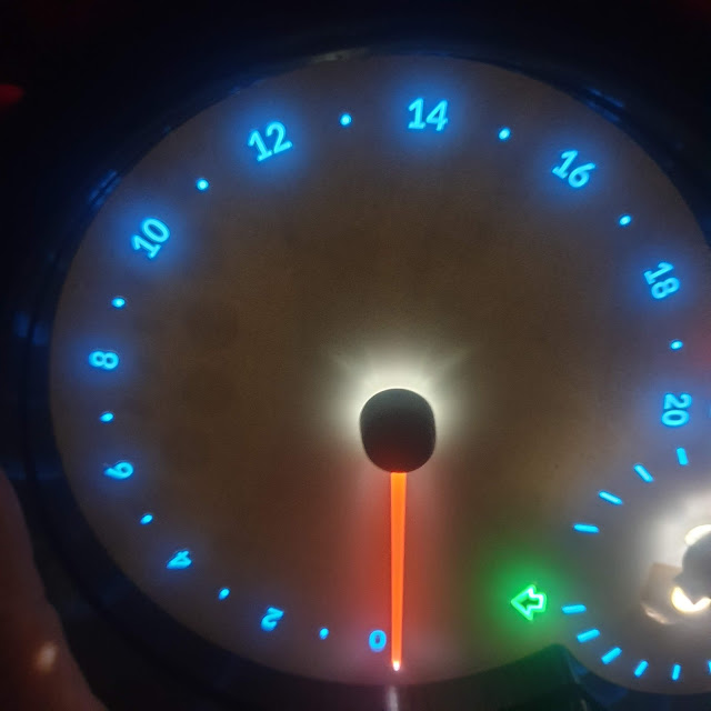
You might notice that the background here looks a little un-black. It turns out that someone mis-labelled one of the opaque paints in Bedford’s workshop, and unfortunately a paint that wasn’t total blackout was used by accident. I’ve since returned these to Bedford and they’ve applied an additional blackout layer to the 3 units so I eagerly await testing once I get them. Aside from that minor issue though, I think they look fantastic, and the colour inversion between day and night is really dramatic. Love them! On to the next…
Comments
Post a Comment